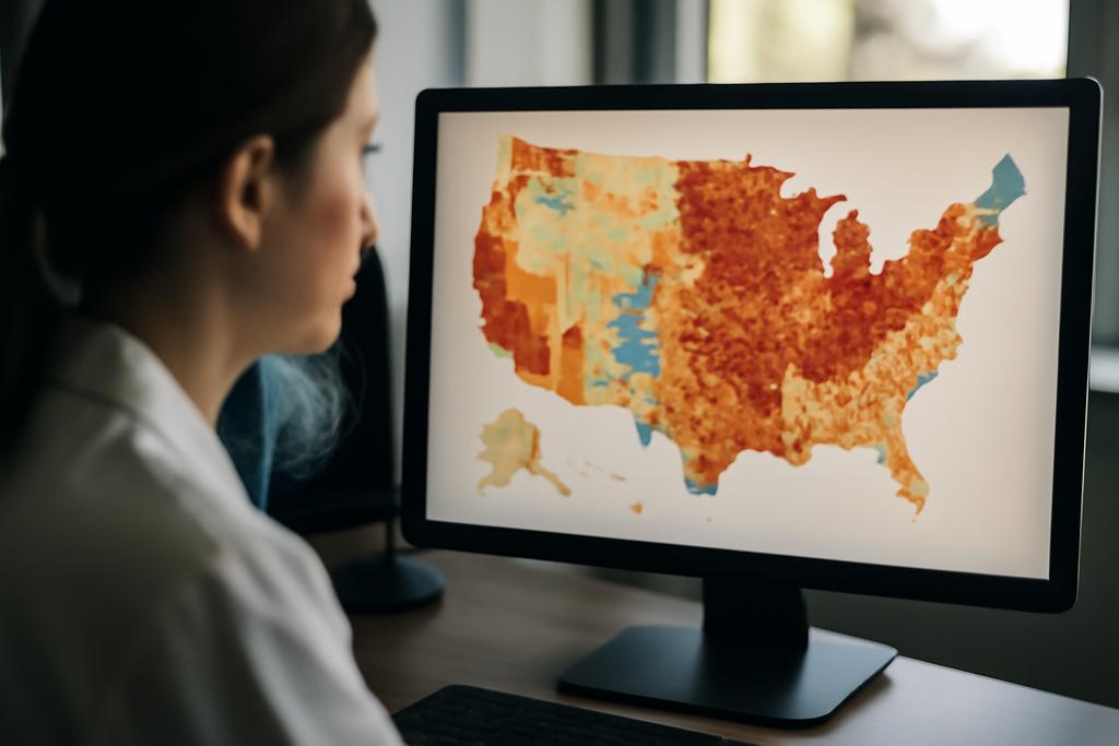
In a world of data, not all lists are created equal. Some are clean and predictable, others resemble a crowded shelf where a handful of titles fill the page while thousands of tiny volumes hide in the margins. Real systems—languages, city sizes, baby names, or scientific citations—follow patterns that look simple at a glance but hide a lot of drama in the tails. The drama is not random chaos; it is a structured turbulence that shifts who counts as big and who barely registers at all.
A team from the University of Vermont, rooted in the Vermont Complex Systems Institute, has built a suite of tools to map that drama. Led by co-first authors Jonathan St-Onge and Ashley Fehr, with Peter Dodds guiding the broader project, they introduce allotaxonometry and rank-turbulence divergence as a way to compare two complex systems without forcing everything into tidy charts. Their work aims to turn two messy lists into a story you can see, read, and compare side by side—without asking you to pretend the world obeys a single rulebook.
What follows is not a crash course in heavy mathematics but a tour through a family of instruments designed to surface the differences between two real world systems. Think of it as a map and a list that travel together: a visual atlas that highlights not just what is different, but where that difference comes from in the ranking of things that come in wildly varying sizes. It is a tool for scientists, but it is also a way for curious minds to ask the right questions about change, diversity, and the uneven ways in which novelty spreads through culture and nature.
A map for messy data
Many real world systems are heavy tailed. A few items dominate the scene, and a long tail of rarities stretches far behind. In language, a handful of words carry most of the traffic; in cities, a few megacities dwarf the rest; in baby names, a handful of favorites repeat across generations while thousands of names flicker in the margins. That structure—what scholars call a heavy-tailed distribution—matters because it makes simple averages and均衡 comparisons misleading. The universe of types is not evenly populated, and the real action often lives in the tail where things are rare and volatile.
The core idea behind allotaxonometry is to compare two systems by their rankings of types, not just their counts. If you list every type by size in system A and in system B, you get two rankings. The interesting question is how those rankings differ as you move from the most common types to the rarer ones. In two languages, for instance, the most frequent words might line up neatly, but the moment you scan down to the thousandth word, a different set of words starts to dominate in each language. That shift—this type turbulence—tends to grow as you descend the ranks, and that growth carries information about how the systems are evolving or diverging.
Rank-turbulence divergence, the instrument at the heart of this work, is a single tunable number that captures how much two ranked lists differ, with a crucial knob: alpha. As alpha changes, the instrument can be tuned to spotlight rare, tail items or the most common items. In other words, you can adjust the lens to ask different questions of the same data. When alpha is small, the divergence is pulled by the tail; when alpha grows large, the spotlight shifts toward the head of the distribution. This flexibility makes RTD a kind of universal dial for comparing heavy tailed systems, a way to quantify not just whether two systems are different, but what kind of difference they embody.
From Matlab dashboards to browser-based storytelling
The authors did not stop at theory. They built a practical ecosystem of tools designed to be approachable, reproducible, and capable of handling truly large datasets. The original allotaxonometer runs in Matlab, which is well suited for big numbers of types and for probability based divergences that tolerate zeros. But to broaden access, the team also stitched together a JavaScript package that powers a web tool and an accompanying Python package that researchers can script themselves. In other words, they built a ladder with rungs for different communities—data scientists in Python, web storytellers in JavaScript, and researchers who still lean on Matlab for heavy computation.
The web application is a centerpiece for outreach. It lets users upload two data files, pick an alpha, and watch an allotaxonograph—the map plus a companion list of the top contributors to divergence—take shape in real time. The interface is designed for exploration: you can toggle between systems, slide the alpha knob, and download a static image for sharing in a report or a slide deck. The goal is simple in spirit: make a powerful tool that even a non specialist can poke at, learn from, and narrate with confidence.
Beyond the visuals, the project embodies a design philosophy. Accessibility is not an afterthought but a core requirement. The team speaks frankly about the challenges of weaving together different programming ecosystems while keeping installation easy and reproducibility high. The outcome is an ecosystem that invites experimentation while preserving the rigor that scientists rely on. It is a synthesis of story and science, where the tools are as important as the ideas they reveal.
Why this matters across fields
Allotaxonometry is not a niche curiosity about names or words. It is a general instrument for comparing any two heavy tailed, type based systems. That includes languages and literary corpora, markets and wealth distributions, ecological communities, and the citation networks that drive science. The common thread is not the particular domain but the shape of the distributions and the turbulence of their rankings. In each case, the question becomes whether the two systems share a core structure or diverge in ways that reveal underlying dynamics, constraints, or cultural shifts.
What makes this approach compelling is its emphasis on ranking rather than raw counts. This aligns with how humans experience scale in the real world: the top items matter, but the real drama often hides in the long tail. By focusing on ranked order and using the tunable alpha, researchers can tease apart whether changes are driven by a few dominant actors or by a broader reorganization of many small players. The same framework that can compare a pair of baby name lists can, with appropriate data, compare two languages over centuries or two urban systems over decades. The method lives at the intersection of statistics, visualization, and storytelling, offering a language for describing how complexity folds itself into patterns we can grasp.
There is also a methodological upside. The toolset invites a consistent, principled comparison across disciplines. It provides a common vocabulary for discussing how systems change, which in turn helps scientists from different fields share insights and replicate analyses. In an era when interventions—whether policy choices, platform dynamics, or conservation efforts—rely on understanding distributional changes, having a robust, interpretable, and broadly accessible instrument matters. It is the kind of development that can help scientists speak a common language about the messy but essential question: how does a complex system evolve, and who changes the most as it does?
What surprises researchers found and where this goes next
One of the striking aspects of rank turbulence divergence is the way the alpha knob reshapes the story you hear from the data. A small alpha tends to pull up the influence of rare items, highlighting changes in the tail that might be invisible if you only watched the head. A large alpha, by contrast, makes the divergence feel like a snapshot of the most prominent players—the big, recognizable names or items that dominate the landscape. That duality is not just a mathematical curiosity; it mirrors how cultures and markets can change in different ways. Sometimes a handful of new actors rearranges the entire scene; other times a slow reordering of thousands of minor players quietly shifts the balance. RTD gives researchers a way to quantify and compare both modes of change within the same framework.
The visualization component is more than pretty graphics. The allotaxonograph pairs a map like histogram in logarithmic rank space with a balance plot and a dynamic wordshift view that highlights which types drive the divergence. It is a narrative device as well as a statistical one. By turning numbers into a visual story about which items move, which stay, and which disappear, the instrument invites readers to see patterns that would be easy to miss in a table or a scatter plot. This is where data visualization earns its keep: it translates abstract divergence scores into human intuition, a bridge from theory to understanding that a broad audience can cross without a decoder ring.
Looking ahead, the authors sketch a pragmatic path for growth. They propose expanding the set of divergences and distributions the tools can accommodate, reducing external dependencies to streamline installation, and continuing to refine zero probability handling for probability based measures. There is also a conscious push to deepen the storytelling aspect, exploring new frontiers where allied communities can contribute, test, and extend the toolkit. The work is a reminder that good science is not just a proof but a product: a usable instrument that people will actually pick up, try, and trust.
University of Vermont researchers led by Jonathan St-Onge and Peter Dodds have given us a versatile lens for the messy, fascinating world of ranked data. The alloy of theory, software, and storytelling in this project points toward a future in which comparing complex systems becomes as natural as reading a chart—and as revealing as a good narrative about how our world changes, one rank at a time.