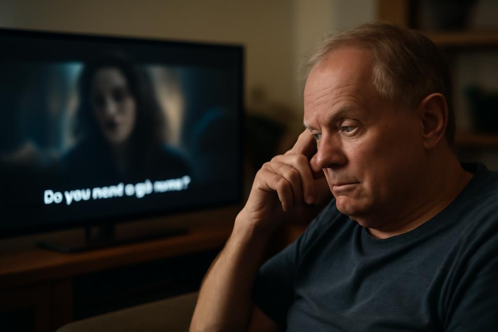
Subtitles sit at the edge of our living-room screens, a quiet string of letters promising to translate sounds into words. For many, they are a reliable helper: a shield against mishearing in a busy kitchen, a guide while watching foreign-language cinema, a safety net during late-night streaming. But the people for whom subtitles matter most—the millions living with aphasia after stroke—often find that the traditional caption style becomes a separate puzzle: the timing is fast, the text dense, the lines short and jagged, and the words sometimes look like stepping-stones that drift away just when understanding should land. The result isn’t a smoother viewing experience; it’s a barrier to the very act of following a story. This is where Zihao You and Michael Crabb from the University of Dundee step in, not with a slick shortcut but with a bold question: can subtitles be redesigned to meet people where they are, not where the system assumes they should be?
The paper Subtitled Media Adaptations for People with Aphasia, published for the Access InContext Workshop at CHI’25, maps a field that’s still mostly unturned: the place where accessibility research meets the small moments of everyday TV watching. You and Crabb argue that a one-size-fits-all approach to subtitles—white text on a black strip at the bottom of the screen—doesn’t just disappoint users; it marginalizes a community by default. They pledge a practical, humane path: build future media solutions that are personalized, context-aware, and designed with input from people who live with aphasia. It’s a vision that treats accessibility less as a checkbox and more as a design philosophy, a way of saying that the way we present language on screen should bend to human variation, not the other way around.
To translate that idea into something tangible, the authors foreground a simple but powerful move: involve the people who will use the product in the design process. They point to participatory design and Double Diamond thinking as maps for research and development—start with discovery, move to problem framing, and then prototype in a loop that keeps end users at the center. The study doesn’t pretend to have all the answers, but it offers a road map: gather insights from speech-language therapists and people with aphasia, test low- and high-fidelity prototypes, and measure what actually helps people read and understand onscreen text. In other words, it’s a practical manifesto for turning empathy into usable, scalable design that can improve lives.
Rethinking Subtitles for Accessibility
Today’s subtitles are a default feature, not a choice. They assume that speed and density of text can travel at a universal tempo and that readers will follow along without cognitive friction. But aphasia disrupts that tempo in predictable ways: some words come more slowly, others require re-reading, and the rhythm of a sentence can feel like a stream that splits into eddies. The Dundee paper argues that the problem isn’t simply about legibility; it’s about timing, density, and the spatial layout of captions on the screen. A caption that arrives too quickly or that bundles an idea into a single block of words can overwhelm working memory, leaving the listener with a partial meaning. If we want subtitles to be a bridge, not a barrier, we need to rethink not just font size but the entire choreography of how text arrives and stays visible.
One striking critique the authors make is about the bottom-centered placement that’s become a de facto standard. It feels familiar, but it also constrains reading strategies that people with aphasia use to chunk information and map words to sounds. In their survey of the current landscape—from BBC guidelines to streaming interfaces—the authors show that the same interface design can help some users and hinder others. The article’s core claim is not that captions are bad; it’s that the default mode can create a mismatch between what the viewer needs and what the system provides. If a viewer’s processing pace runs slower, a long block of text can break comprehension; if the caption line length is too short, the reader may lose track of the sentence’s structure. Small changes can yield outsized gains in understanding and comfort.
That’s where personalization enters as a design principle. The authors don’t just advocate for one more option; they propose an ecosystem of adaptable features that respond to context—what content you’re watching, how you’re watching it, and where you are in the day. They point to tangible design decisions, from richer typography and flexible line breaks to alternative modalities that might accompany subtitles, such as non-visual cues or haptic feedback in the future. The aim is not to remove the text but to tailor it: to provide options that reduce cognitive load when needed, without taking away the trust that subtitles offer to countless viewers. It’s a difference between a one-size-fits-all garment and a wardrobe that fits the wearer’s body and mood.
Designing with Aphasia in Mind
Aphasia is a language and communication disorder most commonly arising after a stroke, and it does not respect the neat boundaries of a screen. It can affect understanding, speaking, reading, writing, and even numbers. The paper estimates that hundreds of thousands of people in the UK alone live with some form of aphasia, and the ripple effects touch daily life—conversations at home, workplace comprehension, and the simple joy of watching a movie without fighting the interface. The authors frame this not as a biomedical challenge but as a design opportunity: if we acknowledge the cognitive realities behind the symptoms, we can craft tools that truly level the playing field for everyday media consumption. That shift—from accommodation to collaboration—changes who gets to shape what the future of subtitles looks like.
To make that shift practical, the authors lean on two engines of design thinking: co-design and the Double Diamond model. The idea is to invite people with aphasia and the professionals who work with them into every stage of the process, from early interviews to testing prototypes in living rooms or study setups. This approach isn’t about asking for feedback once a feature is built; it’s about letting people guide what should be built in the first place. The process is iterative, a steady braid of discovery, definition, development, and delivery that keeps the human at the center rather than relegating them to a checkbox in a requirements document. It’s a reminder that technology truly shines when it is co-authored with the people who will live with it.
An interesting part of the study is the way it combines qualitative and quantitative methods. Exploratory interviews with speech-language therapists inform the user requirements, while structured surveys of people with aphasia help translate those requirements into design guidelines. The researchers also propose a suite of prototyping tools—eye-tracking to see where viewers look, horizontal prototyping to test multiple features in a staged order, and mixed-method evaluations that blend numbers with the nuanced language of user interviews. That blend matters: numbers can tell you what changes, but stories tell you why those changes matter. When you can connect a tweak in line length to a moment of clearer understanding, the work stops feeling theoretical and starts feeling urgent.
Prototype, Personalization, and the Road Ahead
Crucially, the work outlines a path from insight to impact: build a high-fidelity prototype that can personalize and tailor subtitles to individual users, then test it in real-world contexts. The goal is not to replace subtitles with a radical new modality but to create an adaptable system that can adjust to a user’s reading pace, attention span, and content complexity. The authors imagine a future where streaming platforms offer a spectrum of subtitle behaviors—slower pacing for dense dialogue, color-coded cues to signal speakers, or alternative line-breaking rules that preserve sentence structure. They even contemplate non-visual channels as potential companions for those who benefit from tactile or auditory augmentation. It’s a modest seed with big branches.
Why does this matter beyond a lab paper? Because media is a central thread of modern life, a way we learn, connect, and entertain ourselves. For people with aphasia, a more nuanced subtitle system could translate into more independence: you could watch a favorite show without needing a caregiver to read along, or you could follow complex dialogue at your own tempo and still stay in the flow of the story. It also sets a more humane standard for platform design: if accessibility research becomes a live design practice rather than a separate feature, the screen becomes something you can tailor to your own cognitive rhythm, not something that imposes a single tempo on every viewer. The paper’s authors—Zihao You and Michael Crabb of the University of Dundee—make it clear that this is just the beginning, but it is a beginning that treats readers as co-collaborators rather than passive recipients.
In the broader arc of media accessibility, the work slots into a larger shift toward participatory, human-centered design. The authors frame their contribution as threefold: first, they extract design guidelines from conversations with clinicians and people with aphasia; second, they deliver a high-fidelity prototype that demonstrates how personalization could work in practice; third, they plan to gather empirical data that captures what real users experience when confronted with adaptable subtitles. The implication is clear: the next generation of subtitles could be a living interface, constantly tuned to the listener’s pace, context, and preferences. That is not merely a nicer interface; it is a reimagining of how media talks to the brain, a reframing of accessibility as a design conversation rather than a gating mechanism.