Breast cancer screening saves lives when it happens on time, but access to screening is not evenly distributed. A team at the University of Tennessee Health Science Center, across its Center for Biomedical Informatics and allied departments, has stitched together a map of the United States that shows where screening rates cluster high or low and why. What began as a routine look at numbers in a national health survey turns into a story about place, opportunity, and the social texture of health care. The researchers—led by Soheil Hashtarkhani and Arash Shaban-Nejad—combined geographic data with a dash of machine learning to ask not just where people are getting screened, but what in their environment nudges those decisions. The result is a rich, people-centered picture of a nationwide program meant to catch cancer early, but that sometimes falters at the edges of poverty, education, and access.
In an age when “big data” is supposed to democratize knowledge, this study makes a stubborn case that numbers alone aren’t enough to fix inequities. The researchers pulled in a sprawling catalog of social determinants of health—everything from how many mammography centers sit within a 10-mile radius to the local level of educational attainment, poverty, insurance coverage, and even the value of homes. They then layered this with a powerful tool from modern data science: a random forest model that can tease apart nonlinear relationships and interactions among dozens of factors at once. The approach isn’t about replacing human judgment with a machine; it’s about letting the data whisper the likely levers of change, so policymakers can aim interventions where they’ll actually move the needle.
Writing in JMIR Cancer, Hashtarkhani and colleagues from UT‑HSC emphasize that their work is ecological in nature—a reminder that conclusions apply to neighborhoods and census tracts, not to any single person. Yet even at this broad scale, the study shines a light on practical, near-term actions: increase the number of screening facilities within reach, invest in education to boost health literacy, and target outreach in communities where uninsured and Hispanic residents are more prevalent. The paper doesn’t pretend to have all the answers, but it does offer a concrete map of the terrain and a set of signposts for where help is most urgently needed.
Where screening clusters high and low
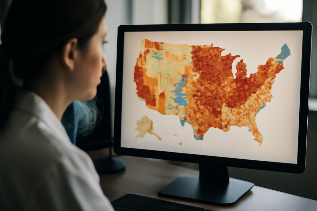
Geography, in health science, is often not just a backdrop but an active player. The authors used data from the CDC’s BRFSS-based PLACES project for 2018 and 2020 to estimate, at the census tract scale, how many women aged 50 to 74 reported having had a mammogram. The geographic canvas was vast: 72,337 tracts nationwide, with 49,118 meeting their data quality bar. The average screening rate hovered around the high 70s, but the map tells a sharper story than a single percentage ever could. In the eastern and northern United States, many tracts reached or exceeded roughly 71% screening. In contrast, central and southern regions trended lower, often dipping into the 60s. The spatial patterns persisted across the two time points studied, a finding the authors view as evidence of underlying, enduring drivers rather than ephemeral trends.
To make those patterns legible, the team turned to a classic GIS tool called Getis-Ord Gi, which highlights clusters of unusually high or low values—hotspots and coldspots. The resulting visuals were more than pretty maps; they were a compact, interpretable window into equity. Hotspot counties spread along the east coast and into the northern states, where access to screening and awareness campaigns may be stronger. Coldspot regions clustered in the Midwest and parts of the South, where barriers—financial, logistical, or informational—appear to impede routine screening. The authors note a subtle shift between 2018 and 2020: while broad regional patterns held, some western border counties and parts of Texas and Arkansas saw declines, hinting at how local forces and system shocks (like the onset of the COVID-19 era) can nudge outcomes in particular directions.
What the machine learning reveals about the pattern
Beyond maps, the study leans on a machine-learning workhorse—random forests—to model how a tapestry of social and access factors explains census tract screening rates. The model’s job is to predict the average screening rate (averaged over 2018 and 2020) from dozens of neighborhood attributes. The UT‑HSC team didn’t stop at building a model; they compared several approaches—random forest, linear regression, and support vector machines—and used cross‑validation to guard against overfitting. The random forest came out on top, with an R2 of about 0.645 and an RMSE of roughly 2 percentage points. That means the model could account for a meaningful portion of how screening rates vary across places, while still leaving room for the real-world messiness that data can’t capture perfectly.
To translate the model’s “black box” into human insight, the researchers turned to SHAP values (Shapley Additive Explanations). These values tell you which features pushed a tract’s predicted screening rate up or down, and by how much. The six most influential variables stood out: the share of the population that is Black, the number of mammography facilities within a 10‑mile radius, the share of adults with at least a bachelor’s degree, home value, the share of Hispanic residents, and the share without health insurance. The direction of influence was telling. Tracts with larger Black populations tended to have higher predicted screening rates, linked in part to targeted outreach and community health programs. More facilities nearby correlated with higher screening, as one might intuit. Higher education rates aligned with higher screening, underscoring the role of health literacy. Conversely, higher shares of Hispanic residents and of uninsured people tended to pull screening rates down, illustrating persistent structural barriers.
These findings come with important nuance. The study did not claim that simply living near a facility guarantees screening, or that race is a causal lever for health behavior. Instead, SHAP analyses reveal the fat diodes of influence in the data: what factors, at the neighborhood level, tend to move screening rates up or down, and in which directions. The researchers stress that, even with richer data and robust models, we’re still looking at population-level signals. Interventions must be designed with that ecological awareness in mind to avoid over-generalizing to individuals.
From numbers to policy: what this means for real people
So what do these numbers mean for families, clinics, and policymakers trying to close the gaps in breast cancer screening? The study’s strongest message is pragmatic and pretty hopeful: improve access and improve information, and you tilt the odds toward earlier detection. If a community has more screening centers within reach, and if the local education level and overall economic health are higher, screening rates rise correspondingly. That’s not merely a correlation; the model’s SHAP analysis points to tangible levers that communities and health systems can pull—without waiting for broader national policy shifts.
But there are caveats worth naming aloud. The authors emphasize COVID‑era context as a potential disruptor. The 2020 screening rate dipped slightly compared with 2018, and the pandemic is known to have disrupted routine health care across the board. The BRFSS PLACES data are modeled estimates built from survey responses, not direct counts at the patient level. All of this means we should treat findings as directional guidance rather than a guaranteed prescription. And because the study operates at the census tract level, it’s crucial to avoid inferring individual behavior from neighborhood statistics—a reminder of the ecological fallacy that often lurks in population science.
Still, the paper’s combination of spatial analysis and machine learning offers a replicable blueprint for other health outcomes. If you want to understand, say, where asthma care or diabetes screening is most or least accessible, a similar approach can reveal not just the “where” but the “why” behind disparities. The UT‑HSC team also highlights an actionable takeaway that policymakers can actually act on in the near term: invest where the data say the need is greatest, and design outreach that not only informs but also reduces financial and insurance barriers. In other words, the map becomes a toolkit for deploying real-world remedies, not a museum display of numbers.
One striking thread in the findings is the role of education and insurance coverage as amplifiers or dampers of screening uptake. Areas with more people holding bachelor’s degrees tended to show higher screening rates, which aligns with the idea that health literacy—knowing what to ask for and why—can be as important as having a clinic nearby. The presence of more mammography facilities within a 10‑mile radius mattered too, though the distance to the single nearest facility wasn’t the dominant story the model told. That nuance hints at the reality that people weigh options and barriers in complex ways: cost, coverage, appointment availability, and even the perceived quality of care all mingle with proximity to shape decisions about screening.
The study’s authors are careful to point out that, despite a sense of progress, notable disparities remain, especially affecting uninsured populations and communities with large Hispanic populations. It’s a sobering reminder that health equity is not a single knob to twist but a constellation of policies: expanding coverage, subsidizing screening, diversifying the health workforce, and supporting community organizations that can bridge trust and literacy gaps. The data-driven approach helps identify where those policies might have the strongest payoff, while the ethical guardrails—avoiding ecological overreach and respecting the limits of observational data—keep the conversation grounded in real-world nuance.
In short, this work is less about solving a single problem than about equipping a health system with better eyes. It demonstrates how high-quality data, analyzed through modern machine learning, can illuminate the stubborn corners of public health that traditional statistics might miss. It’s a reminder that equity isn’t a single leap but a series of deliberate steps, taken where evidence points most clearly. And for the researchers themselves, it’s a proof of concept that complex, place-based health questions can be answered without losing sight of the human beings at the center of the data—the families seeking screening, the clinicians who recommend it, and the communities that stand to gain the most when access becomes truly equitable.
Indeed, the study’s authors deserve credit for turning a national health statistic into a navigable map of opportunity. As policymakers debate how to allocate limited resources, works like this offer a compass: where to invest, what to measure, and how to interpret the signals that emerge when data, science, and compassionate public health converge. The university behind this effort—the University of Tennessee Health Science Center—can point to a robust collaboration across pediatrics, biostatistics, radiation oncology, and health sciences as a model for how to translate messy, real-world numbers into concrete steps toward a healthier, fairer United States. And the lead investigators, Hashtarkhani and Shaban-Nejad, show how curiosity, method, and a human-centered aim can come together to turn data into practical wisdom.