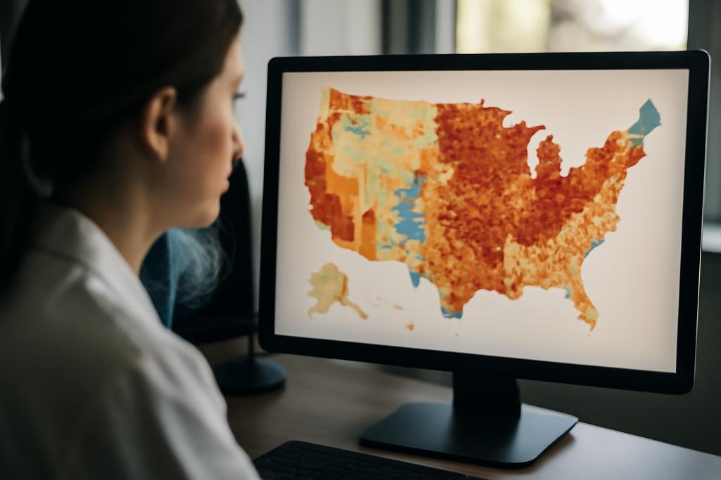
Charts are the shorthand of data. They compress messy reality into a few lines, bars, or colors that you can scan in seconds. That speed is a strength—until it becomes a hazard: a tiny design choice can nudge interpretation in a direction you don’t even notice. In a world where visualizations shape news, policy, and everyday decision-making, a tool that helps us spot and fix misleading charts doesn’t just save time. It protects trust. MisVisFix, a new interactive dashboard, aspires to do just that. It invites users to detect, understand, and correct misleading visualizations in a way that feels less like policing and more like guidance from a careful, data-literate friend.
MisVisFix isn’t a generic alarm system. It’s a full-cycle assistant: it detects a spectrum of known misrepresentation techniques, explains why a given feature is problematic, and actually generates corrected visualizations. The project comes from a research group at Stony Brook University, with Amit Kumar Das and Klaus Mueller at the helm, and it leans on a pair of multimodal large language models—Claude and GPT—to read charts, reason about their design, and propose tangible fixes. The aim is practical and scalable: to move from abstract warnings to concrete improvements that anyone can inspect, compare, and learn from.
The study builds on a widely cited taxonomy of misleading visualization techniques that enumerates 74 distinct issues. That catalog is not just a catalog; it’s a map of how charts go wrong—from obvious tricks like truncated axes to subtler choices like questionable color encodings or selective data presentation. MisVisFix doesn’t pretend to be omniscient. But the results are striking: it correctly identifies 96% of the issues in its test set and can classify them by severity—major, minor, or potential. That’s not a guarantee of perfection, but it’s a powerful claim about turning a taxonomy into usable, real-time feedback for people who create or scrutinize visuals.
Why does this matter beyond the lab? Because visual literacy—the ability to read charts with a critical eye—has become a societal skill. Journalists, policymakers, teachers, and ordinary readers all rely on visuals to make sense of numbers. A tool that explains what’s risky about a chart and then shows a corrected version can transform how we assess evidence in public discourse. It’s not about destroying nuance; it’s about making the underlying data more legible and less prone to misdirection. And it’s not just for experts: the system is designed to be accessible to designers, students, and fact-checkers who want to learn by doing.
As a lens on where data communication is headed, MisVisFix also reveals something about the collaboration between humans and AI in understanding charts. The project doesn’t pretend to automate consensus or replace domain knowledge; it augments human judgment with a structured, auditable process. In practice, that means you can hover over a highlighted region in a chart to see why a misrepresentation matters, compare two corrected versions side by side, and even ask for a modification in real time through an interactive chat. The goal is not pristine automation but a transparent, iterative partnership that improves as users teach it new tricks.
Inside the Dashboard: How It Detects and Explains
At the heart of MisVisFix is a modular pipeline that moves from image to insight to improvement, without asking users to supply source code or charts’ underlying files. You drop a bitmap of a chart into the interface, and the system begins a multi-stage analysis. The first stop is data extraction and chart-type detection—tasks that Claude 3.7 handles exceptionally well in this pipeline. By reading titles, axis labels, legends, and annotations, the model reconstructs the chart’s data representation from the pixels themselves. This is not a perfect data-dump from a spreadsheet, but a careful reverse engineering that’s good enough to reason about the visualization’s claims.
To make sense of the chart’s design choices across 74 known issue types, MisVisFix uses a structured detection framework run by two multimodal LLMs: Claude 3.7 and GPT-4.5. Each model is prompted through a three-step process: extract data from the graph, sort and organize the extracted data, and then answer questions based on that data. This stepwise approach isn’t just about accuracy—it’s about building a shared mental model that the models can cross-check against each other. The result is a robust cataloging of potential problems that can be parsed quickly by the user and prioritized by severity.
The system doesn’t stop at “you have a problem.” It localizes the issue to precise coordinates on the chart. Through a localization technique that analyzes the image and returns top_gap and left_gap percentages, MisVisFix marks the exact region where the problem resides. Hovering over an issue in the dashboard highlights the corresponding region on the chart, creating a direct, visual link between abstract language (the name of an issue) and a tangible place on the image. In other words, the dashboard translates a complex critique into a pinpointed graphic cue you can act on immediately.
Another breakthrough is the dashboard’s ability to generate corrected visualizations. The system uses the extracted data and the identified issues to produce Python-based corrections with Matplotlib or Seaborn, preserving as much of the original aesthetic as possible while addressing the misleads. If a chart is fundamentally misdesigned—such as a pie chart with too many segments or a map whose projection warps distribution—the tool can replace the chart type entirely with a more honest depiction. The result is not a simple fix but a redesigned visualization that honors the data’s relationships while removing interpretive traps.
Importantly, MisVisFix uses a dual-model setup to balance strengths and reduce blind spots. Claude 3.7 excels at data extraction and contextual understanding, while GPT-4.5 shines in structural analysis and code generation for the corrected visuals. This complementary pairing is more than a neat trick; it’s a practical architecture for tackling the entire lifecycle of a misleading visualization—from detection to correction to evaluation.
The interface itself is designed for learning as much as for correction. Panels show the original problem, two corrected versions (one from Claude, one from GPT), and a live chat that lets users request refinements. A dataset upload panel is there for cases where data extraction falls short and you want to supply the ground truth directly. There’s even a learning mechanism: users can flag new issues—ones the system didn’t catch—and, with a click, contribute them to the knowledge base. It’s a little democracy of design choices, where human feedback helps the system grow more capable over time.
Corrections That Learn: A Dual-Model, Interactive Designer
In the real world, mistakes in visualization aren’t just technical; they’re educational. The MisVisFix team ran a rigorous evaluation: a dataset of 450 visualizations, including 360 misleading and 90 valid examples, distributed across bar charts, line charts, pie charts, scatterplots, and other types. The numbers aren’t just impressive on a scoreboard; they map onto a practical truth: automated detection, when paired with well-designed explanations and concrete corrections, can beat human-only or single-model approaches by a wide margin. Across all types and issues, MisVisFix achieved an F1 score of 0.96, significantly outperforming an LLM-only baseline and existing visualization linting tools that require underlying code rather than bitmap input.
Beyond raw accuracy, the system’s localization—the ability to highlight exact chart regions corresponding to issues—proved remarkably reliable. The average localization precision hovered above 90%, with the highest performance for discrete elements like axis labels and titles and somewhat lower but still strong performance for color schemes and data point encodings. In practice, this means a reader can see precisely which stroke, axis, or label is responsible for a misinterpretation and address it directly, rather than wondering which element is warping perception.
Perhaps even more striking is the system’s correction capability. In many cases, MisVisFix could generate a corrected chart that preserves the original’s intent while removing the misleading elements. For example, a dual-axis line chart with mismatched magnitudes might be replaced with a single-axis display that communicates the trend without distorting magnitudes. A brittle pie chart with many similar colors can be converted into a sorted bar chart that clearly communicates the relative sizes. The emphasis is on readability and honesty, not erasure of style. When the changes were subtle, the system aimed to respect the designer’s aesthetic goals; when the underlying design was indefensible, it didn’t try to “fix” form, it fixed function.
Experts who evaluated MisVisFix’s output resonated with its practical value. They described it as a useful, time-saving “AI teammate” that helps catch issues they might miss in quick reviews. They also highlighted educational potential—the way explanations could illuminate why a particular design choice misleads and what it risks in terms of audience interpretation. The interactive chat was repeatedly praised for turning the analysis into a design conversation rather than a verdict handed down by a machine. In short, MisVisFix is meant to be a collaborator that teaches you to read charts more carefully, not a gatekeeper that shuns imperfect but understandable visualizations.
Beyond the Page: Implications, Limits, and The Road Ahead
MisVisFix arrives at a moment when social media, newsrooms, and classrooms are learning to navigate a flood of visual information. The project even imagines a social media workflow where corrected visuals can be surfaced alongside original ones, a feature the authors call a potential “Truthify” toggle. In practice, this means viewers could switch between the original misleading chart and a corrected version, with the dashboard surfacing the precise issues that drove the difference. It’s a practical antidote to misinformation’s speed: you get the same emotional punch from a chart, but you gain a transparent path to the truth behind it. It’s not censorship; it’s literacy in action, a way to make the data tell a more accurate story without sacrificing the immediacy that makes charts compelling.
There are important caveats, though. The researchers are clear that MisVisFix is not a universal oracle. Highly domain-specific visuals—like intricate genomic plots or specialized scientific graphs—can present challenges that require tailored knowledge or human expertise. Image quality matters: low-resolution or heavily compressed visuals degrade performance, a reminder that the best machine will still struggle when the signal is weak. And while the authors report substantial gains, the system’s latency—roughly two to three minutes per chart due to sequential model calls—means it’s best suited for review, education, and newsroom workflows rather than real-time dashboards.
Another caveat is bias and context. Automated detection can reflect the limitations of the taxonomy it’s trained on, and cultural or discipline-specific norms may shape what counts as “misleading” in one setting but be perfectly legitimate in another. The MisVisFix team invites domain customization and ongoing human-in-the-loop learning to address these subtleties. The project’s learning mechanism, where users can propose new issues, is more than a feature; it’s a recognition that the landscape of misrepresentation is always evolving and that systems must evolve with it.
What does this mean for the everyday reader, the journalist, or the data-wielding professional? It raises the bar for accountability in data visualization, not by policing creativity but by elevating clarity and honesty. It invites us to treat charts as collaborative artifacts—things we can improve together with intelligent tools and human judgment. If MisVisFix becomes a common companion in laboratories, newsrooms, lecture halls, and busy dashboards, it could shift how we teach visualization literacy, how we evaluate data-driven claims, and how we design visuals that illuminate rather than obscure truth.
In the end, MisVisFix is not a verdict about how charts should look; it’s a structured invitation to interrogate them. It embodies a practical philosophy: when data speaks through graphics, we should listen carefully, cite the exact places where misinterpretation can happen, and offer clearer alternatives that preserve meaning while removing bias. The project’s provenance—researchers at Stony Brook University, led by Amit Kumar Das and Klaus Mueller—reminds us that rigorous, human-centered experimentation can yield tools that feel like partners rather than prompts for retreat. And that partnership, in a world awash with visuals, could be exactly what we need to keep our charts honest, our decisions wiser, and our data-driven conversations more trustworthy.
Lead researchers Amit Kumar Das and Klaus Mueller from Stony Brook University have built MisVisFix to span detection, explanation, and correction of misleading visualizations, turning a challenging taxonomy into an interactive, learnable tool that can adapt to new tricks and new audiences. This is not the end of the story for data visualization integrity, but it is a meaningful leap toward a future where readers can trust the charts they rely on—and learn from them when they can’t.